Expressive React
Material 3 Expressive components for React: shape-morphing buttons, springy motion and dynamic color. Copy them in with the shadcn CLI or install from npm.
Oct 2026 - Presentreactdesign-systemtailwindmaterial-3shadcnopen-source
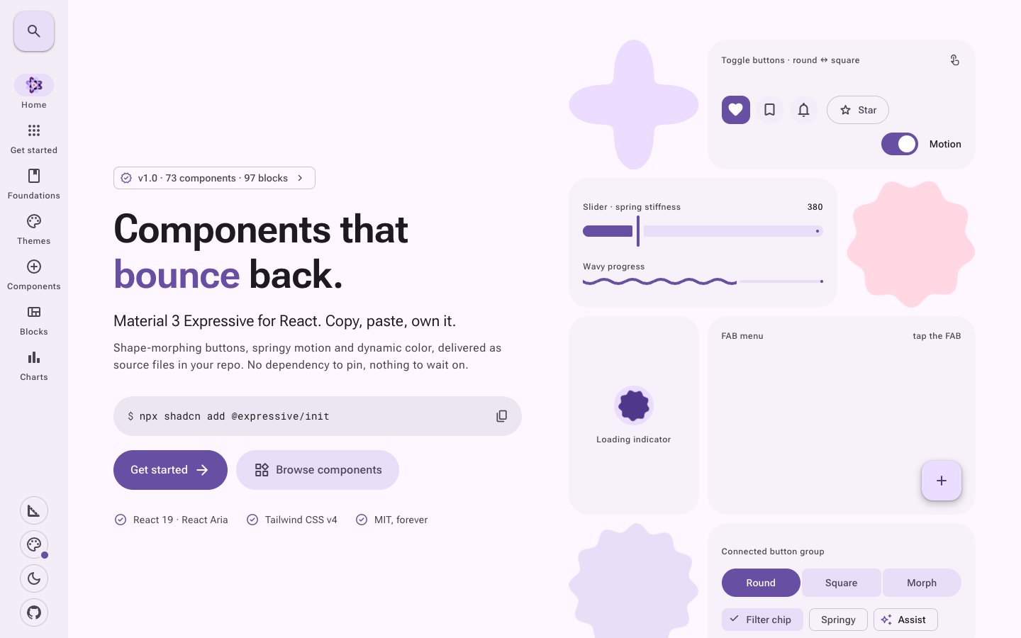
Expressive React brings Google's Material 3 Expressive design to React: shape-morphing buttons, springy motion and dynamic color. It's built on React Aria Components and Tailwind CSS v4, and you can use it two ways: copy the components into your project with the shadcn CLI and own the code, or install the expressive-react npm package and update it like any other dependency.
What it does
- 73 components. Buttons, button groups, FABs, chips, dialogs, menus, sliders, switches, tabs, text fields, date fields, carousels, navigation bars, snackbars, loading indicators, wavy progress and more, each following the M3 Expressive spec values
- 97 blocks. Ready-made screens built from the components: login and signup flows, settings pages, dashboards with KPI cards and charts, app shells, data tables, marketing landing pages and full templates up to a 21-page admin. Every block works in light, dark and RTL, from compact to extra-large windows
- Dynamic color. Pass one seed color and a full light and dark scheme is generated with the M3 2025 color spec, in nine scheme variants (tonal spot, vibrant, expressive, fidelity, content, neutral, monochrome, rainbow, fruit salad) and three contrast levels
- Theme builder. Pick a seed, variant and contrast on the site and watch the whole site recolor, then copy the CSS
- 42 theme presets. Complete looks with their own canvas, card and hairline tones, typeface, corner scale and elevation style, from Quiet and Paper to Meskel, an Ethiopian-inspired theme that renders Ge'ez script. Every preset passes WCAG AA in both light and dark, and the test suite checks it
- Charts. Recharts themed with M3 color roles, so every chart follows dark mode and seed changes without re-rendering
- Docs for every component. A live preview, the code, install commands, usage, API reference, accessibility notes and the M3 spec values
How it is built
- Components: React 19 and React Aria Components for accessibility and focus handling, styled with Tailwind CSS v4. Color roles are CSS variables (
--md-primary,--md-surface-container-highand the rest) mapped to Tailwind colors - Distribution: a shadcn registry at
expressive-react.moolerz.et/r/{name}.json, sonpx shadcn add @expressive/buttondrops the source into your repo, plus theexpressive-reactnpm package with one ESM entry point per component, types included and"use client"kept - License: MIT